%201.avif)
Webflow Agency
Your next-generation Webflow partner: GEO-optimised, designed for growth.

GEO is the new SEO. We build Webflow sites that rank on Google, get cited by AI engines, andturn that visibility into qualified pipeline.


What our customers think of us
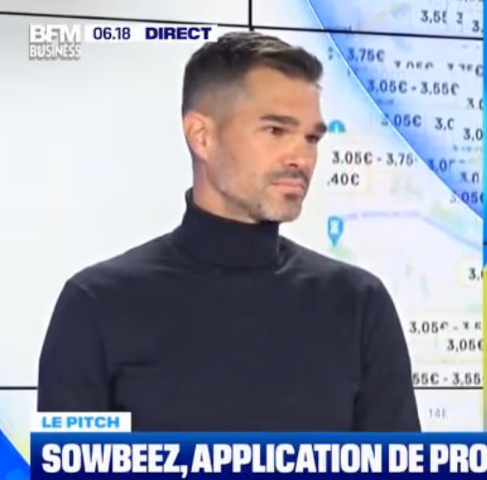
“We have been working with the Mekaa agency for a year for the SowBeez app and site, and we are thrilled with their work. Their expertise and creativity made it possible to successfully bring our project to life. A big thank you to the whole team for their professionalism and their constant commitment!”

"Au total, j’ai pu travailler avec la team Mekaa sur 4 projets, et je peux dire que c’est une des meilleures agences Webflow de Paris. Ils ne sont pas de simples partenaires, ils ne travaillent pas pour nous mais avec nous. Merci à toute la team et spécialement à Alex"

“I had the chance to work with Mekaa in the person of Alexandre. His taste for technical challenges, his continuous availability and his business vision were real assets for the management of more than 6 projects in less than 2 years. Definitely one of the highest levels of no-code development in France. Thanks.”
.avif)
I had the opportunity to collaborate with Mekaa for an ambitious digital project, and the result exceeded all my expectations. The team is creative, responsive and highly professional at the same time. Their mastery of Webflow is simply impressive. They understood my needs from the start and delivered a site that was both aesthetic, fluid and optimized for conversion. Special mention for their support from start to finish: we feel that they are really invested in the success of each project. I 100% recommend Mekaa to any person or company wanting a high quality Webflow site. Thanks again to the whole team!

“We had the pleasure of collaborating with Mekaa to create our site. Alexandre was able to understand our needs and deliver a result that met our expectations. Professionalism, responsiveness and creativity: Mekaa was able to honor our project.”

“It's really a pleasure to work with the Mekaa team. We have already collaborated on more than 15 projects, and each time, it is a real pleasure. They are hyper-responsive, agile, highly organized and methodical. What impresses us above all is how advanced they are in no code, always at the cutting edge. Working with them is both fluid and inspiring.”

“I can only recommend the services of the MEKAA agency! The rendering of my website exceeds my expectations! Quality, responsiveness and follow-up are the 3 pillars of our collaboration.”

Thank you for the super beautiful site created! Responsiveness, availability and professionalism! Very good experience and a lot of kindness! I recommend +++

I highly recommend the Mekaa agency! It is a trusted partner with whom we have been working for several months and with beautiful and well-executed projects. The team is top, responsive and very professional.
Our projects Achieved
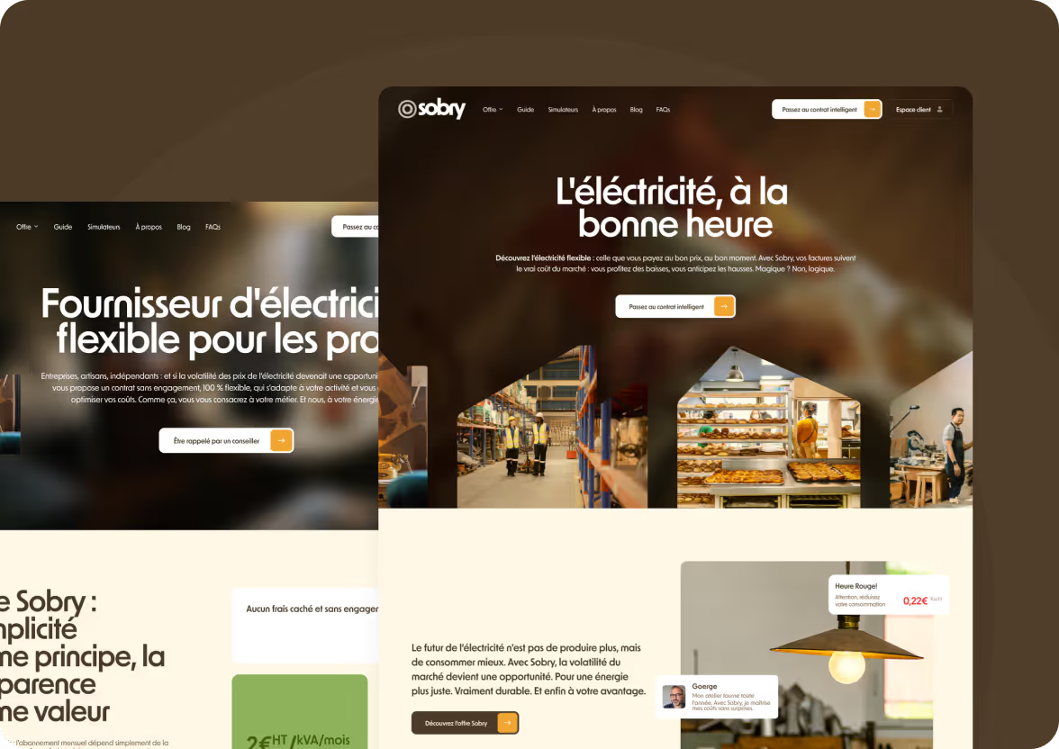
Creation of the Sobry website
For Sobry, a new generation energy supplier, we created a Webflow site and efficient landing pages, with a reverse proxy architecture.
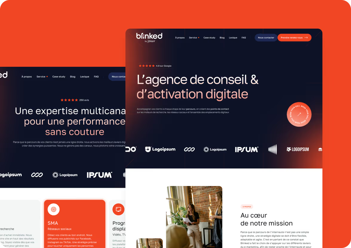
Redesign of the website of the snack content agency Blinked
For the Blinked agency, which specializes in snack content, we redesigned the site in order to modernize the design, clarify the offer and improve SEO visibility.
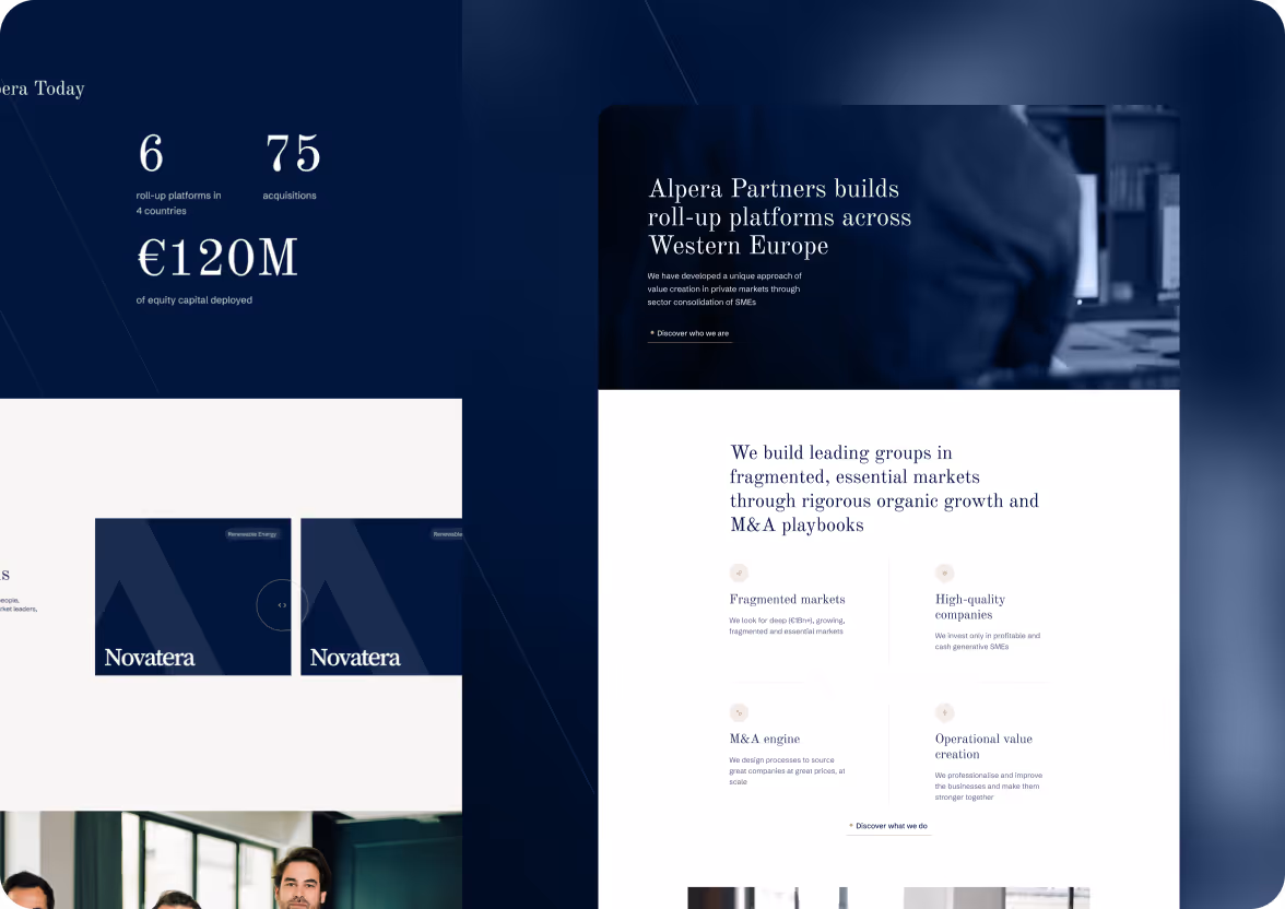
Creation of the Alpera Partners website
For Alpera Partners, an investment company specialized in sector consolidation in Europe, we created an institutional Webflow site, clear and optimized for SEO.
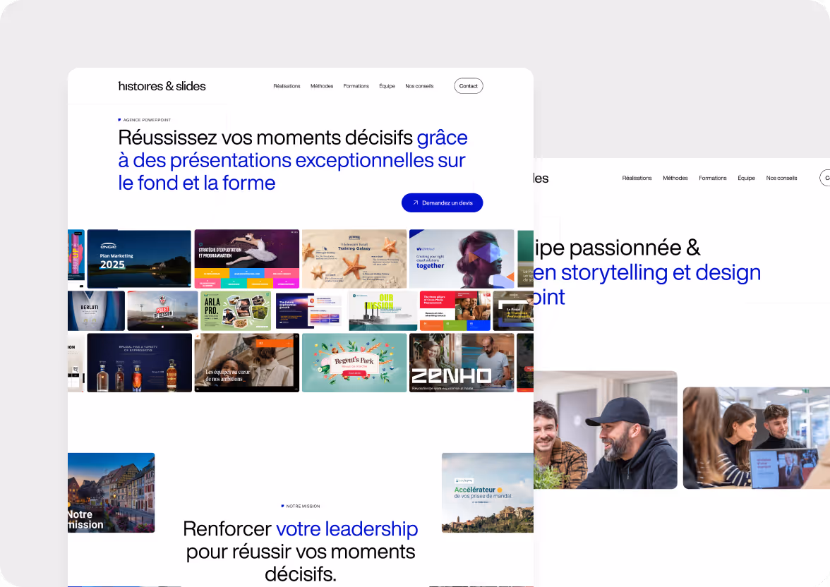
Graphic redesign and SEO of the site History & Slides
For Histoire & Slides, we carried out a complete graphic redesign and optimized the site for SEO in order to improve visibility and conversion.
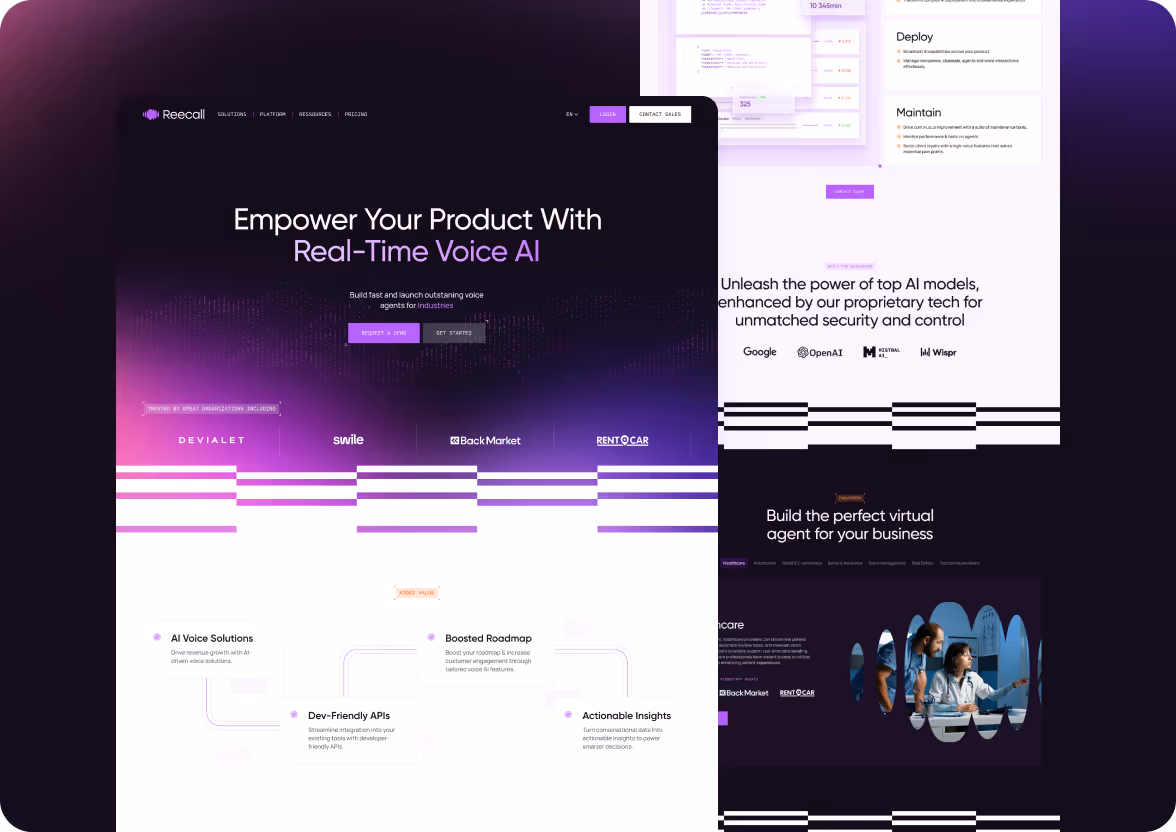
Redesign of the Reecall website
For Reecall, a SaaS specialized in customer reminders, we redesigned the Webflow site to maximize conversion and structure a sustainable SEO strategy.
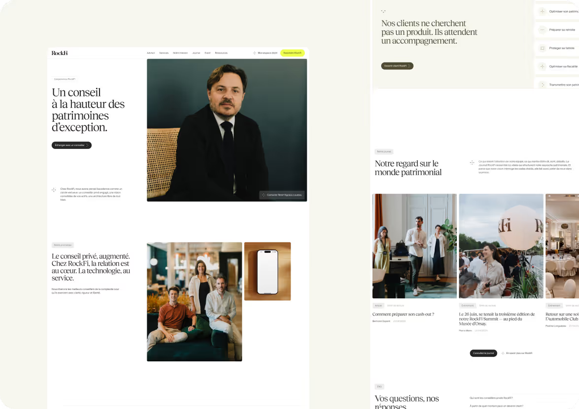
Creation of the RockFi website
For RockFi, a player in private investment management, we designed a premium Webflow site, structured to inspire trust and generate qualified leads.
Each of our actions is
Website creation
Design a site that appeals to your customers and increases your revenue.
Webflow development
Create a successful Webflow site that generates sustainable revenue
SEO/AEO strategy
Attract qualified traffic that is ready to buy.
Free audit
Test your pages, keep what converts best, eliminate friction.
Webflow maintenance
Continuously evolve your site to maximize your conversions.

Webflow places 100% trust in us now it's your turn
We are proud to be certified Webflow Global Leader — an official recognition of our Webflow expertise, of our trustworthiness, and our ability to create Webflow sites efficient and well thought-out. This trust is what we put at the service of your projects.
A clear process, designed for performance
Creating a successful Webflow site is no accident.
Creating a Webflow site that converts is not a matter of feeling — it's a method.At Mekaa, we follow a structured process that aligns design, UX strategy, development and continuous optimization for maximize your return on investment.
Framing & workshop
We start with a strategic workshop to understand your challenges, your business objectives and your users. This framework makes it possible to define a solid base before any production.
UX strategy & architecture
The tree structure and the user journey are structured. The objective: to make navigation intuitive and conversion-oriented, by laying the foundations of an effective site.
Web design UI
We translate your messages into a striking design, aligned with your brand image. Each screen is designed for visual impact and ergonomics — desktop & mobile.
Webflow integration
We develop your site on Webflow with pixel-perfect attention. Our objective: performance, fluidity, SEO and ease of use for your teams.
Training & follow-up
Once online, we train you in Webflow so that you can be autonomous. And if necessary, we remain at your side with regular follow-up or continuous maintenance.
A Webflow site that converts, It's more than a beautiful design
At Mekaa, we design Webflow sites that don't just look nice.
We work on every detail — from structure to UX, from content to performance — to create a site that speaks to your visitors, engages them... and makes them take action.
Our approach is simple: a well-designed site is a site that converts better.
Questions frequently asked
Why choose a Webflow agency like Mekaa?
Creating a Webflow site with Mekaa means benefiting from comprehensive strategic support:
from framing to UX, from design to integration, everything is orchestrated to help you achieve your business goals.
Unlike a traditional agency, a specialized Webflow agency like ours masters the entire chain: design, development, SEO, automation, hosting.
We are working on Webflow for a simple reason: it is the tool that allows us to do things quickly, well, and sustainably.
What it changes in concrete terms:
- A 100% tailor-made site (no theme)
- Real performance (SEO, speed, responsive)
- A well-thought-out conversion tunnel from the start
- A simple back office, to make you autonomous
Is Webflow good for SEO?
Webflow is one of the most efficient CMS for SEO, provided it is well used.
We apply logic from the design stage Technical and semantic SEO :
What we do:
- Clean HTML structuring (Hn, aria-label, landmarks, etc.)
- Fast loading (WebP, WOFF2 fonts, lazyload)
- Custom title and description tags
- Readable URLs, internal linking, and 301 redirects
- Schema.org/ Open Graph integration
- Clean Sitemap.xml and robots.txt
The whole thing without plugin no unstable overlay. Webflow allows for native, clean and agile SEO.
What is GEO and why is it essential?
The GEO (Generative Engine Optimization) is the art of making your web content visible, usable, and recommended by generative artificial intelligences — ChatGPT, Perplexity, Gemini, or Google AI Overviews.
At Mekaa, a specialized Webflow agency, it is the basis of our method for creating efficient websites in the age of AI research.
How our Webflow agency applies GEO:
- Semantic content structuring (direct answers, question/answer format, factual data)
- Citable content: short sentences, clear statements, verifiable information
- Intent-oriented copywriting: understanding what AIs are trying to answer to your future customers
- Authority and credibility: social proof, numerical data, explicit sources
- Continuous optimization based on emerging AI queries in your industry
A beautiful invisible AI website is decoration.
We design sites that exist in the responses generated — where your customers are looking for tomorrow.
Unlike other French Webflow agencies, Mekaa integrates GEO best practices right from the design stage, not as a late addition.
This is what makes us one of the best Webflow agencies in France for business performance in the age of AI.
Do you offer maintenance?
Yes, we offer scalable maintenance formulas after going online.
Webflow maintenance =
- Small adjustments (content, structure, blocks)
- Add new pages or sections
- SEO/CRO monitoring
- Technical update (CMS, redirects, responsive)
And above all, we train you so that you remain autonomous on simple tasks.
What is your methodology for creating a Webflow site?
Our method is available in 5 main steps :
- Workshop & framing : we align your business challenges with the objectives of the site
- UX strategy : we structure the routes and the tree structure
- UI design : we create impacting and responsive models
- Webflow integration : pixel-perfect, SEO-ready, fast
- Training & follow-up : so that you can evolve independently
Each project is managed like a product sprint. The result: clarity, agility, performance.
What types of Webflow sites do you develop?
We mainly support:
- startups in the launch or redesign phase,
- scale-ups looking for performance,
- B2B SMEs oriented towards lead generation.
Webflow project types:
- Showcase site with conversion tunnel
- Marketing landing pages
- Dynamic CMS for regular content (blog, articles, use cases)
- CRM/Web analytics integrations
- Redesign slow, outdated or underperforming sites
Can I modify the Webflow site myself?
Yes, it is one of the great advantages of Webflow.
Once the site is delivered, you will be able to:
- modify the texts and visuals,
- add blog posts or CMS pages,
- Adjust links or publish a landing page
And we accompany you with a custom Webflow training (videos + live session).
Zero dependency. 100% control.
Why Mekaa rather than another Webflow agency?
Because we don't deliver a “nice site.” We deliver an AI visibility tool, designed for your business goals, integrated into your stack, managed by Webflow experts who have an obsession: impact in generative responses.
Our strength as a certified Webflow agency:
- A structured process following the best practices for Webflow development and GEO optimization
- Real AEO sensitivity to create content that generative AIs cite and recommend
- An expert, clear, direct and involved agency
- Total autonomy for you at the end thanks to the Webflow CMS
Unlike other French Webflow agencies, we do not sell design. We sell a lasting presence in generative AI responses. With Mekaa, you are working with a Webflow agency specialized in GEO performance, recognized among the best Webflow agencies in France for its ability to design sites that appear where your customers are looking for tomorrow.
Do you offer A/B testing?
Yes.
We can set up:
- simple tests via Webflow Logic or Splitflow
- advanced testing with Google Optimize or AB Smartly
- iterations on copywriting or CTAs
The aim: not to rely on intuition. But test. And adjust.
Is Webflow better than WordPress?
It all depends on the need, but for 90% of modern B2B projects, the answer is: yes.
In short: if you want a fast, elegant, SEO-optimized site, easy to evolve → Webflow wins hands down.
Can you take over an already existing Webflow site?
Yes.
We regularly produce Webflow audits to optimize a site already in place.
Sometimes, all you need to do is reorganize the content, work on the hierarchy, optimize load times, or add CRO logic.
And if a redesign is needed, we explain why — and how to frame it effectively.